
In this video, I want to discuss another renko position trading chart and an addition to the ETF portfolio. We will be talking about the USO oil ETF, using our price envelope reversal-midline reject base renko trade setup on the chart.
Additionally, I want to talk about the renko chart brick and price envelope percent parameters, and what I have been doing to select them.
You are looking at a 60 minute chart for the USO ETF oil fund. The USO is highly liquid, and it’s also a good selection for an ETF trading portfolio to get additional diversity.
This chart period goes from 11/27 through the 12/27 9:00ct bar. During this time the USO has gone from 32.97 to 35.97 – and now the important question: do you see any trade setups that you would have done that are more than horizontal consolidation breakouts?
My answer to that question is no, I couldn’t have traded that chart. And that is why renko chart trading was originally looked at as an addition to our trading method strategies.
No, not so I could trade the USO ETF – I was actually looking first at the renko charts for replacing the 5 minute facebook chart and to use to get back to some emini russell day trading.
Renko Chart Brick Size And Price Envelope Percent
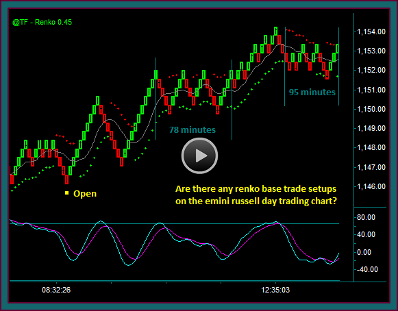
Emini Russell Renko And Tick Chart Comparison
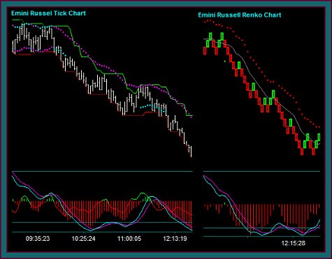
Do you remember this chart from the using renko charts for emini russell day trading video? My objective was to replace the emini russell tick chart with the renko chart.
And how did I come up with the renko brick size that was used. It was done visually, trying to match the tick chart swing with the renko chart swing – synching the charts for their span on the chart and key price areas.
The price envelope percent parameter was also done visually – I wanted the outer envelope reversal points to synch with the high and low swing points on the chart.
This was a 360 tick chart and a renko chart .7 brick; I think the outer envelope was .15%. I have since changed that envelope percent to .125% – and also made the decision to do most of the emini russell trading with a 240 tick and .45 renko brick pair, with a .075 percent envelope.
Some notes on the renko brick and price envelope percent parameter:
- The renko indicator default is 1%, but the input is later changed in almost all instances
- It is typical for the slower moving underlyings to have a smaller brick size
- It is typical for the higher price underlyings to have a smaller relative envelope percent to synch it with the swing points and reversal points
- When pairing a slow and fast renko chart – the envelope percent tends to be lowered as the brick size is made smaller
So, I don’t have a formula for trying to set these numbers. I am sure that if we googled renko brick setting that we would get some suggestions – but I didn’t want to set these that way.
We are trying to adapt these charts to our existing trading method that uses specific trading indicators. And as such, I have been mostly interested in the visual approach that I mentioned – with the objective of clearing up the time or tick charts.
So, I have essentially taking an underlying chart I would be trading and matched it with a renko brick chart. Do note that I am doing this in tradestation and ninjatrader uses a different brick size calculation – but I would be using the same approach in that charting program.
As I work with the renko charts more and the brick and envelope parameters, I will be sure to keep everyone updated with the things that I come up with.
Here are the parameters that I am using for the 3 index ETFs:
- IWM = .30 brick size – .45 envelope percent
- SPY = .30 brick size – .30 envelope percent
- I have also been looking at .25 brick size charts – a smaller brick size and the smaller envelope percent would be a function of the SPY having lower volatility than the IWM
- DIA = .25 brick size – .30 envelope percent
USO ETF Renko Trading Chart
You are now looking at the renko chart for the USO that was selected to ‘match’ the 60 minute chart – you can see where I drew the vertical line for 11/27.
The renko brick size is .1 and the price envelope percent is .6. Do you see any of the renko base trade setups on this chart and do you think you could have traded it, as opposed to the USO 60 minute charts?
I am going to discuss the USO renko trades, but first let me make a point – we aren’t going to make much money trading the USO with many of the very good setups, because the current range it has been trading in:
- The highest 14 day average true range since 11/6 is .4964
- In September the 14 day ATR was in the 60s, with the highest at .6750
- But what we will get is an ETF that fits well in a bigger portfolio, since it wouldn’t have a high correlation to the different index ETFs
And when there is an extended price move, we could have a setup to be in that swing – you can see that is the case for this chart.
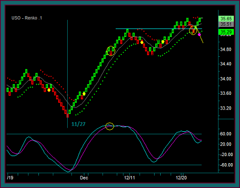
You are now looking at the USO renko chart with the trades marked:
- Yellow dot1 and yellow dot2 should be very clear – this is our base renko price envelope reversal-midline reject with mex flow trade setup
- You can see another green-red-green renko brick pattern midline reject – but if you look at the mex flow extreme, and there was a cross, the trade setup can’t be used for an addon
- Yellow dot3 and yellow dot4 are also the renko base trade setups
- Now here is an example of the amount of activity on this chart – which wouldn’t be good if the USO was only being traded, but it is fine for trading an ETF portfolio
- Yellow dot3 is a 12-13 trade and yellow dot4 is a 12-18 trade
- Now look at yellow circle2 and the yellow line-purple dot
- The circle is the blue line resistance to support price test and the price envelope initial reverse – there is no trade setup there
- I held the trade on the brick break of the blue line [remember that is only a .10 move at that point] – and if there had been a midline reject with a completed red brick and the start of the next brick, which is what the purple dot represents, the USO buy would have been reversed to short
So that ends this renko ETF position chart trading video. We have another ETF to add to the portfolio, and we discussed insights for selecting the renko brick and price envelope percent parameters.
Be the first to comment