
This renko trading video is going to discuss momentum and its effect on price continuation, and especially the problems related to entering a trade directly into a price momentum divergence.
I am going to start this video by showing you the recording for 3 renko chart trading segments. I am not going to say anything during the playback – I just want you to watch the chart for renko trade setups and price movement, and then we will discuss what you just saw.
So, what did you see during the renko chart recording? Did you see multiple renko trade setups that were all losing trades – and if yes, why did these trades lose?
What you saw may have been renko brick midline reject patterns, but you did not see renko trade setups.
Why, because all of these would have been trades against momentum. And worse than that they were trades into price momentum divergences testing support or resistance, meaning that the supposed renko trade setup also did not have a profit component.
What Is A Price Momentum Divergence
You get a price momentum divergence [pmd], when there is a higher high in price and a lower high in momentum, or a lower low in price and a higher low in momentum.
Since momentum tends to lead price for continuation, a loss of momentum in a trading swing often precedes a reverse or a transition into consolidation:
- This is why chart reads for momentum extremes and counter momentum are one of our primary trade entry filters
- This is also why mex flow is one of our primary trade setup components
- For instance, a green-red-green renko brick midline reject buy setup pattern includes a retrace from the green brick high to the red brick low – but mex continued to flow up, in the direction of the intended trade, during the retrace
Renko Chart Trades Entered Into A Price Momentum Divergence
Here are the charts that you watched the price recording for:
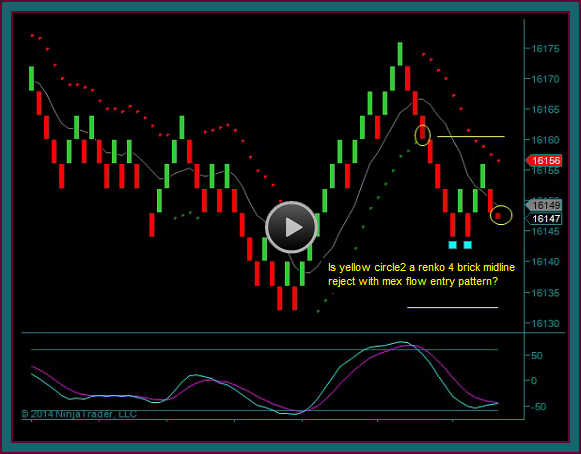
- Both yellow circles are renko brick midline rejects
- But both entries would be counter momentum, where we chart read for a pmd – you will see this even more clearly on the 180 tick chart
- And momentum reads are one of the primary reasons we use the 180 tick price charts with the renko charts
- Additionally, both of these trades would be a pmd low test of support – and wouldn’t even be able to fill a 10 point partial
- The yellow circles on this chart are the same thing
- Counter momentum trades into price momentum divergences and resistance tests
- And regardless of the pmd high, you still can’t take the trade and get an acceptable partial profit
- Now you are looking at the 180 tick chart related to the renko charts
- You should clearly see the price momentum divergences – did you need this chart with the renko charts?
- You did if you wanted to know the real support and resistance prices – and sometimes ttm shows divergences that aren’t seen on the renko charts
- You should clearly see the price momentum divergences – did you need this chart with the renko charts?
Price momentum divergences don’t always lead to a swing reverse, sometimes they are followed by what we refer to as a price momentum divergence failure.
This means that there is a breakout of the divergence area and a resumption of price and momentum continuation. However, that is a different trade setup than we have been looking at.
And in the case of these charts, there was a price momentum divergence swing reverse, followed by base trade setups – trades that you can see at the green dot and red dot, and these trade setups also occurred on the renko trading charts.
Be the first to comment