
Renko trading charts and the way they show price movement are beneficial for directional trading. And because of this characteristic, renko charts are also referred to as trend following charts.
This certainly makes these charts useful for our trading strategies, and I have found them to be a good fit with the tactical trading method.
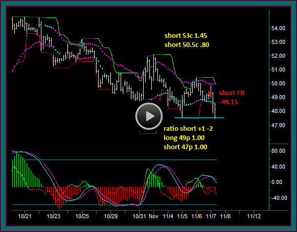
We will discuss this further in the renko charts and trading video below. In this introduction of these charts to our method, I want to show you some recent facebook trades that were done using the charts, along with some new renko trading indicators I have been working on.
What Is A Renko Trading Chart
When using a renko trading chart, the price bars that you are used to seeing will be turned into what are called renko price bricks; these bricks have turned the price data into bars of a predetermined size.
This is in contrast to charts that are time dependent like a 5 minute chart, which will plot a new chart bar each time 5 minutes goes by. Or tick charts that are tick volume dependent and will plot a new price bar every time the set number of ticks are traded.
A facebook chart using a .25 renko size, will give you a new price brick only after a new price move of .25 higher or lower than the previous brick – an emini russel chart using a .70 renko size, will give you a new bar only after a new price move of .70 higher or lower than the previous brick.
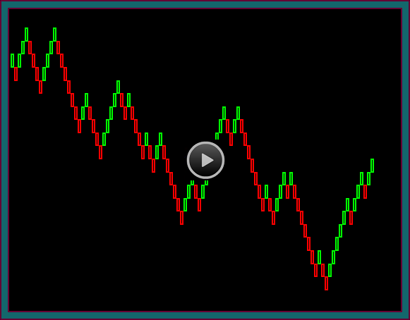
So, when you look at a renko chart you are looking at diagonal swings of boxes that are touching at the corners and are either rising or falling. As you can see, on my renko charts an up brick is green and a down brick is red – you can also visually see what is meant by calling a renko chart a trend following chart.
You are looking at a renko .4 facebook chart, meaning that each of the bricks on the chart are .40 in size – and you can see how you would get a new renko brick, each time price moves .40 higher than the high of the previous brick or .40 lower than the low of the previous brick.
This is also a primary issue that I have with renko charts – getting these bricks of a fixed size, means that there are prices that aren’t included on the chart.
For instance, look to the right at the last red bar. It would appear that the price low is 46.54, however it is actually 46.51. Look at the renko price brick that is the low on the chart. It would appear than this price low is 43.74, however it is actually 43.55.
There are charting programs, like ninja trader that also have renko charts, where the bricks have tails that will show the high price on a down brick and the low price on an up brick.
However, this isn’t available on tradestation, without the use of a custom indicator and I haven’t gotten to that point yet. Additionally, my work with the renko charts has also included a price bar chart, so I know what the actual prices are and where chart support and resistance are.
Renko Price Charts Trading Benefits
On the other hand, the removal of all the time and tick bar noise is a big benefit. As is a chart with a lot fewer bars, because it is dependent on price range and amount of movement. Although it does take some getting used to charts that hardly seem to update or move – would you be surprised to know that the chart you are looking at spans from 10/31 at around 12:30ct to 12/4 at around 9:25.
So why the work with the renko charts – there are multiple reasons:
- Our trading method has always depended on chart reading for price failure setups that lead to continuation breakouts – being able to reduce chart noise is beneficial to that end
- I like the fewer bars and seeing the most significant moves for position trading
- There are fewer decisions to make, which makes it easier to trade multiple underlyings
- These characteristics can make trading more mechanical, which would be beneficial for many traders
- I have been doing some renko chart trading on the emini russel with a .7 brick size, which is pretty similar to a 360 tick chart
- I like doing some russel day trading when it entails bigger swings –vs- the faster tick chart trading that I did for so many years
- Actually what I am most interested in doing is applying this to our stocks and options trading strategies on the IWM ETF
You are now looking at my facebook renko .4 chart with the indicators that I have been working with. If you want more of the renko bars to look at, then you would reduce the brick size – my use of renko charts for facebook trading at this point have included a .4 renko brick with a .25 brick.
This would be similar to any of our method trading, like facebook and using a 5 minute and 60 minute chart – or the futures trading charts that had 2 charts with different tick counts.
To begin with, can you see the last brick on the right? That is a real time brick that hasn’t completed yet but is up at the time. The uncompleted bricks are of smaller size – and most importantly, the high or low will be the same as the last price.
So, seeing the real time price on the trading chart, coupled with a price chart that shows actual price, has offset potential problems with having the fixed size renko bricks.
Renko Charts Trading Indicators
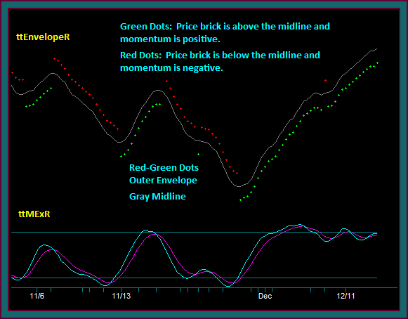
When we look at the indicators on the chart, you will recognize the momentum and mex indicators – although I have made some parameter changes. The indicators on the renko bricks are new.
Momentum Indicators
I will definitely keep mex on the chart, but am not sure about the momentum indicator:
- I like it to see the price momentum divergences – but you can pick those up with mex
- The problem I have had is that it doesn’t have the same sensitivity to the mex extreme lines that we are used to on other charts
- Also, you can’t have a red dot on top without momentum being red – or a green dot on the bottom, without momentum being green.
Price Chart Indicators
The indicators on the chart are different than ttDC. You are looking at a moving average envelope:
- The gray midline is in the center of the envelope
- The dots are set at X% from the midline [it needs to be changed based on the underlying price – with higher prices needing smaller settings]
- The dot location is set where the envelope extreme is essentially the high or low of the brick extreme before they turn
- You get a red dot when price is below the midline and momentum is red
- You get a green dot when price is above the midline momentum is green
- The dots shift has synched with mex in most cases – but you can have a mex extreme without getting a dot shift
- Which I think is a good thing for trading pmd failures
Renko Trading Strategies Trades
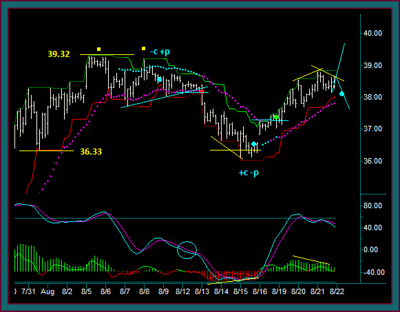
I want to end this first renko trading chart video going over a few of the trading strategy trades and setups that have been the clearest to me at this point – you will note that I have removed momentum from the chart.
The first thing that I want you to notice is the last brick, it should look pretty much identical to the previous chart. However, it’s almost an hour later and price has gone from 47.95 to 47.60 and back to 47.83 – but none of that has shown up, because it is insignificant to the chart.
This discussion is on facebook trading – the blue dots [1 purple dot] are the trades that were done. Don’t be misled by the quantity, remember this chart begins on 11/1.
Blue Circle – Blue Dot1: The dot shifts do have a stop and reverse aspect to them and this renko chart layout may be as simple as trading this mechanically – but I haven’t tried to do that at this point.
For instance, I just cannot see a short setup at the blue circle that would be more than a stop and reverse – but blue dot1 is the kind of setup that we are used to:
- Yellow breakout price reject with mex flow
- Also note the midline reject – that setup component is one that has been very useful
Blue Dot2: I went flat but there was no buy to do – not into the yellow line as resistance:
- And then after that reject and reverse back into sell – I went short at the blue dot
- Note the falling midline reject with mex flow
- And do you also see how this would be a renko brick triple break
Yellow Dot: This was a reject of the outer envelope while in sell, but it couldn’t be done as an addon – not against mex flow.
Blue Dot3 – Blue Dot4: These are like stop and reverse trade, but there is more going.
- To begin with, do these look a lot different than blue circle1
- This would be in terms of a reverse with diagonal breakout potential and a momentum extreme cross –vs- a horizontal breakout
- Additionally, look at the brick breakout setup at the envelope for blue dot3 – and the midline breakout setup for blue dot4
- And how these are synched with the dot shift breakout
Blue Dot5: This setup is essentially the same as the blue dot2 sell – it was quickly a losing trade
Purple Circle – Purple dot: This was traded as a resumption after the buy loss. The full setup came from the renko .25 chart:
- Down sloping midline reject with mex flow
- Triple bottom breakout
Blue Circle2: This was a mex extreme cross dot shift-brick breakout setup – but I couldn’t do the trade into the yellow line. I did go flat the purple dot sell.
Blue Dot6 – Blue Dot7: This was the buy setup done for the current swing – one we know very well as a first continuation trade setup, when noting can be done in the area of the reverse:
- Resistance to support shift line reject
- With mex flow
- Blue dot7 was then done as an addon
- The setup was the rising midline reject
- Still with mex flow
- And a triple break of the 2 purple squares
So, there you go – a discussion of renko charts and some new things I have been working with recently that I think could be beneficial to our trading method strategies.
I will be doing more videos and continue work on tuning in the various related renko and indicator synch settings.
Be the first to comment